
Client Study: Lola B. Fitness
Lola’s Vision is to create a space where women can learn, grow and feel excited about building a healthy body.
Lola Herman is a NASM-certified fitness coach with a background in various sports and training techniques. She is a pint-sized powerhouse who knows her way around a weight room. Lola understands how challenging it can be to balance work, fitness and a social life. Through years of trial and error, she has developed a successful process for guiding her clients through the landmines of fitness and nutrition and towards functional health. Her objective is to create a space where women can learn, grow and feel excited about building a healthy body.
Lola offers a range of services and packages to support her business, including fitness programs that provide structure through personalized weightlifting plans. She also guides clients toward healthy eating with realistic strategies that don’t involve cutting out entire food groups. One of Lola’s most uplifting attributes is her ability to look beyond simply growing her client list. Her ultimate vision is to build a community of women outside of the gym who can provide more for each other than workout accountability. She puts much of her energy and free time into planning recreational excursions for her clients to get to know each other and create new networks and friendships.
The Brief
Lola came to us at an inflection point in her business. She was looking to expand her offerings, upgrade up her marketing assets and rethink her messaging. She had recently added several fitness packages to her services and was looking to upgrade her top-level navigation, rethink the layout of her website and create a powerful, coherent design that carried over into her social media presence. She was also eager to develop and diversify her marketing tactics and needed a well-organized website to serve as a place to funnel new leads.
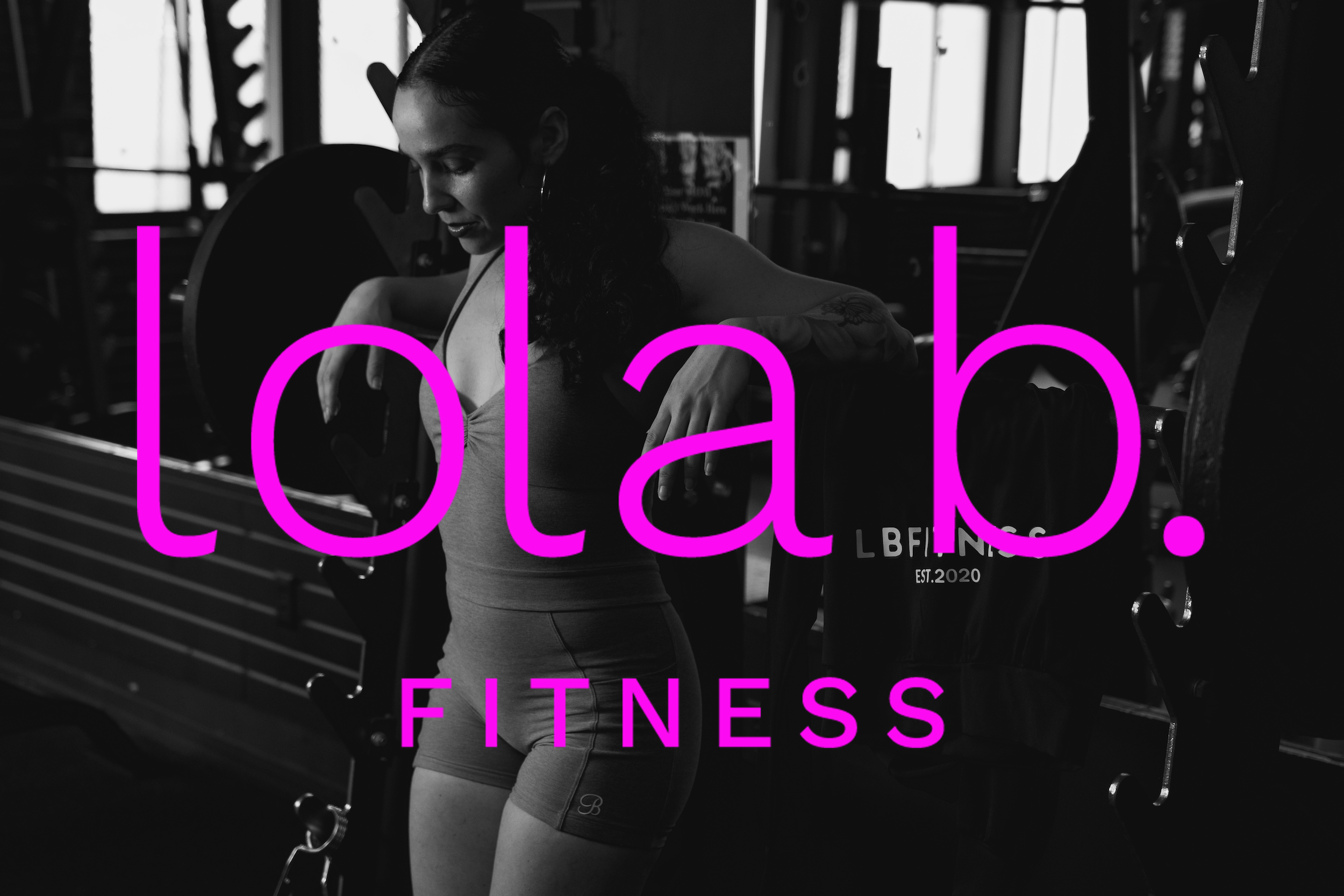
Lola needed a complete brand refresh, starting with her logo and color palette. Her original branding included soft baby pinks and light blues, but when we met her, we realized we needed to reconsider this look. Lola’s personality—along with her smile—is incredibly bold and bright, and we wanted to reflect this sense of exuberance and energy in her website. For the most part, Lola was amenable to the ideas we proposed; however, she had one caveat—it was important to her that we preserve her feminine aesthetic by keeping a shade of pink in the color palette.
The Challenge
Our challenge was clear from the jump: We wanted to honor Lola’s feminine aesthetic, but we also needed to balance the feminine touches with the gravity of her underlying message. For all of Lola’s buoyant energy, it is clear she’s very serious about her mission to help her clients work through their fitness and nutrition goals to find a balanced approach to functional health. It was important that people see the brand and the website and understand Lola’s commitment to life-changing nutrition and fitness strategies that help women get out from under the oppression of diet culture.
In the end, we landed on a look that showcases bright neons—highlighter yellow, vibrant violet, electric blue and yes, a brilliant magenta—against a soft black background. We felt these colors reflected Lola’s big personality and brought a strong, modern sensibility to her brand without diminishing the expertise or professionalism she brings to her work. We also updated her primary logo from a script font to a thin, rounded lowercase font (appropriately called “Work Sans”) and rendered it in magenta to underscore the lively, feminine vibe. To stick with this theme, and to callback to a version of her original logo, we included a secondary wordmark with a hand-drawn script font embellished with a heart.
The Messaging
Lola is an incredibly motivating coach—her voice rings out above the chaos of the weight room and the groans and snorts from the adjacent boxing ring. It’s clear that her group classes love her energy and respond well to her motivation during their workouts. We wanted to capture this feeling by including some of the quirky phrases that Lola uses during her workouts. “Lift heavy, but make it cute” is one expression that seemed like a perfect articulation of her spirit. We thought it complemented her feminine aesthetic and also perfectly captured her personality, so we included it on scrolling banner on her homepage.
When researching the broader status of women’s fitness and how Lola’s services fit with the zeitgeist, we explored current literature around women’s health and fitness. It seems that more women are carving out their own niches in traditionally male-dominated spaces like weight rooms. Additionally, more women are lifting heavy than ever before. New research has shown numerous benefits for women engaged in resistance training, including improved bone density, muscle health and overall fitness. We wanted to tap into this moment and spotlight these benefits on Lola’s page. Our goal was to create a warm invitation for women in the current fitness landscape who are curious about resistance training.
The Photoshoot
Because Lola is such a champion of the women in her community, we wanted to do a photo shoot to capture this sense of camaraderie and to showcase the range of women who have found their way into Lola’s classes. The women were generous enough to allow us into a resistance training session to capture all the sweat and glory. The skylights in the gym ceiling created an added layer of contrast and drama for the shoot, so we captured some fantastic images of the women in action, highlighting their physical strength but also showcasing their energy and excitement. The friendships and connections in the group were clear to us, and we wanted to get some shots of the women hanging around together before and after class to emphasize the sense of community.
In addition to the original photography that we provided, Lola also wanted us to include a few of her clients’ transformation photos, which in her mind, serve as concrete evidence that her instruction yields results. These photos didn’t quite match the dramatic black and white photos we took, so we ended up desaturating them and resized the transformation photos to exclude the participants’ faces and keep the focus on the body.
Lola’s brand refresh balances her bold, energetic spirit with her thoughtful approach to women’s fitness. It’s clear to us that she is building more than just a fitness program—she’s fostering a movement centered on women’s wellness. Her refreshed brand and website invite women of all backgrounds to embrace resistance training, break free from diet culture and build lasting connections. With Lola’s guidance, women are not only getting stronger physically but are also discovering confidence and camaraderie in their wellness journeys.
See some of the work we did for Lola B. Fitness here.